
www.nickjob.co.uk Copyright © 2018– Nick Job
|
|
|
|
www.nickjob.co.uk Copyright © 2018– Nick Job |
|
|
||
|
|
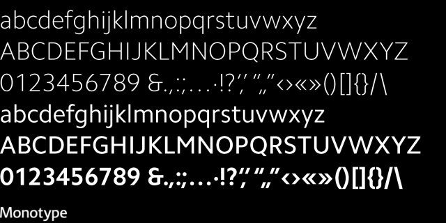
Camphor inspired by railways. A lean, self assured, legible, and versatile font design where the traditions of Edward Johnston's type for the London Underground and Eric Gill's eponymous Gill Sans inspire function. Driven by a determination to avoid all calligraphic allusions, such as angular stress and organic asymmetry, it is narrower than Johnston's type and avoids the quirks of Gill Sans, making for a clean and cool, modern sans serif that lends itself to everything from branding and wayfinding to advertising and editorial design. New sans serif typefaces are released almost daily. The list of truly versatile and distinctive new sans serif designs, however, isn't that long. Most new designs are, at best, yeoman designs. There are, nevertheless, jewels among the rough—a few new sans serif typefaces that are genuinely remarkable; designs that strike that delicate balance between distinction and versatility and address real-world graphic communication needs. While many new sans serifs will fade into the long tail of digital font availability, a few, including Camphor, have what it takes to become true typographic classics. Allan Haley, Director of Words & Letters, Monotype |
|